
Rebuilding A Theme, Part VIII: Content Types
Posted: July 17, 2024 in Drupal, Front End Development
The DLL Catalog site has four main content types:
- Author Authority: Nodes in this content type contain information about an author's authorized name, variations on the name, dates, and various identifiers.
- DLL Work: This content type contains the title(s) of works.
- Item Record: These nodes contain metadata for published editions of works.
- Web Page: This content type is for internet pages that present the texts of works.
The site also makes use of the default Drupal content types Article (for blog posts and updates) and Basic Page (for static content).
The old site made heavy use of Panels, a module that took a point and click approach to content layout. It was useful at the time, but it was complicated and difficult to learn. It has been ported over to Drupal 10, but it now has serious competition from Gutenberg.
Rather than attempt to migrate the panel pages, I'm going to recreate the functionality with a combination of Drupal blocks and Twig. The advantage to this approach is that if there's another big migration in the future, my layouts won't be tied to a specific module that might or might not be ported over to the new version.
Author Authority
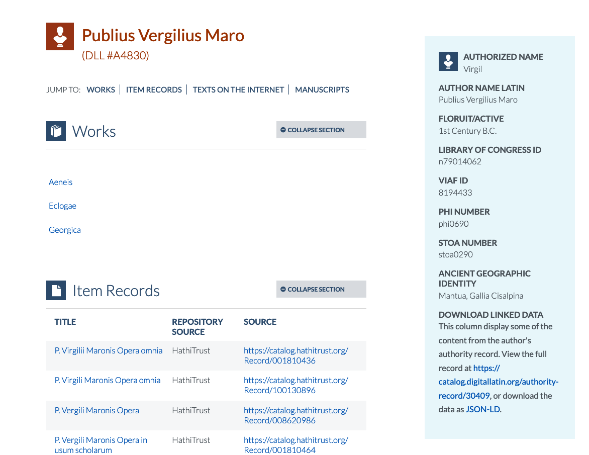
Here's a screenshot of an Author Authority page on the old site:
And here's a screenshot of the same Author Authority as migrated into Drupal 10:
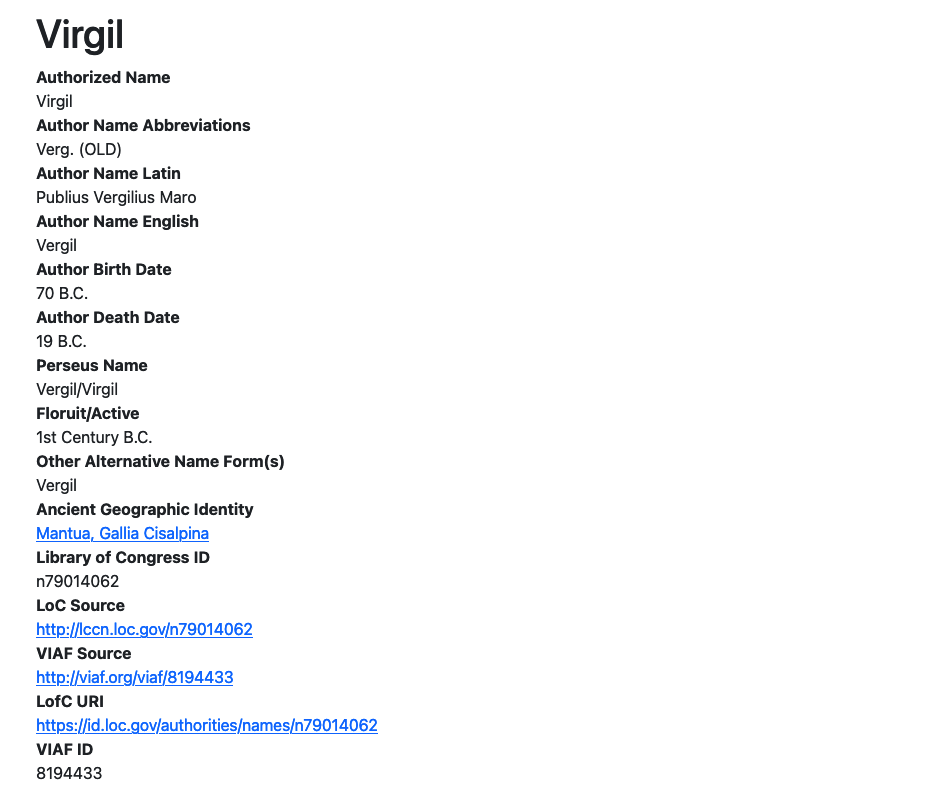
Most of the Author Authority content on the old site is in a sidebar, while contextual views are pulling related DLL Work, Item Record, and Web Page content into Panels. Since I already recreated those contextual views in my new site (see Rebuilding A Theme, Part VII: Contextual Views), I'm ready to insert them into the templates for the Author Authority content type.
But first I need to deal with rendering the fields already in the Author Authority content type.
Node Fields
If I navigate to an Author Authority node and inspect it with my Developer Tools, I'll see that the current Twig template in use is node.html.twig.
<!-- FILE NAME SUGGESTIONS:
   ▪️ node--29982--full.html.twig
   ▪️ node--29982.html.twig
   ▪️ node--author-authorities--full.html.twig
   ▪️ node--author-authorities.html.twig
   ▪️ node--full.html.twig
   ✅ node.html.twig
-->
I also see that node--author-authorities--full.html.twig is one of the file name suggestions, so I'll go to the Bootstrap5 parent theme's templates/content directory, copy the content of node.html.twig, and create a new node--author-authorities--full.html.twig file in my subtheme's templates/content directory, which I have created beforehand. I've selected node-author-authories--full.html.twig instead of just node--author-authorities.html.twig because it is more specific. If I need to create other display modes for this content type, I'll need to make sure that the template I'm making now won't override them. It's always best to be as specific as you can be with your Twig template names—but not so specific that the template applies to only one specific node, like node--29982.html.twig would.
The node.html.twig template renders the content all at once with {{ content }}:
<div{{content_attributes.addClass('node__content')}}>
  {{ content }}
 </div>
In the old version of the site, I used a feature of the Panel layout to display select fields from the content. I can do that directly in Twig by building onto the {{ content }} variable. For example, if I want to display the "Authorized Name" field, I can do this: {{ content.field_authorized_name }}. That will display the field and its markup. If I just want the value of the field, I can do this: {{ node.field_authorized_name.value }}. Here's what happens if I replace {{ content }} with {{ content.field_authorized_name }} in my template:

But we put a lot of work into those metadata records, so I'm going to reverse course and display all the data points available. I think I'll render them in a column on the left side of the page, with the rest of the page reserved for the contextual views that show other records associated with the author.
To do that, I'll do something like what I did when I made three columns for the site's footer. There, I made three columns of equal width. Here, I'm going to make two columns of different widths.
Columns
Bootstrap's grid system is based on twelve columns. When I used three columns in the footer, I didn't specify their width, so they defaulted to four units: 4 + 4 + 4 = 12. But now I want a thin column for the metadata fields and a wider one for the contextual views. I can do that by adding a number value to the col class on div:
<div class="container">
  <div class="row">
    <div class="col-4">Thin column</div>
    <div class="col-8">Wide column</div>
  </div>
</div>
To give you an idea of what that looks like, here's a mock-up:

I'll insert the content into the first column and give it an id to make it easy to style.
<div class="container">
  <div class="row">
    <div id="author-data" class="col-4">{{ content }}</div>
    <div class="col-8">Wide column</div>
  </div>
</div>
And I'll use the {{ drupal_view() }} function from the Twig Tweak module to render my contextual views. Since the contextual views need context (obviously!), I'll need to supply the information they need. In this case, it's the value of the author's DLL Identifier. The Twig Tweak Cheat Sheet shows me almost all the details for doing that.
The example given looks like this: {{ drupal_view('who_s_new', 'block_1', arg_1, arg_2, arg_3) }}. It doesn't tell me that I have to set the values for the arguments. See below for the way to do that:
<div class="container">
  <div class="row">
    <div id="author-data" class="col-4">
      {{ content }}
    </div>
    <div id="author-contextual-views" class="col-8">


        <div id="author-works">
            <h3>Works</h3>
            {{ drupal_view('contextual_view_for_author_authority', 'page_1', arg_1) }}
        </div>
        <div id="author-item-records">
        <h3>Item Records</h3>
            {{ drupal_view('contextual_view_for_author_authority', 'page_2', arg_1) }}
        </div>
        <div id="author-web-pages">
            <h3>Texts on the Internet</h3>
            {{ drupal_view('contextual_view_for_author_authority', 'page_3', arg_1) }}
        </div>
    </div>
  </div>
</div>
With those functions in place, my Author Authority node now looks like this:
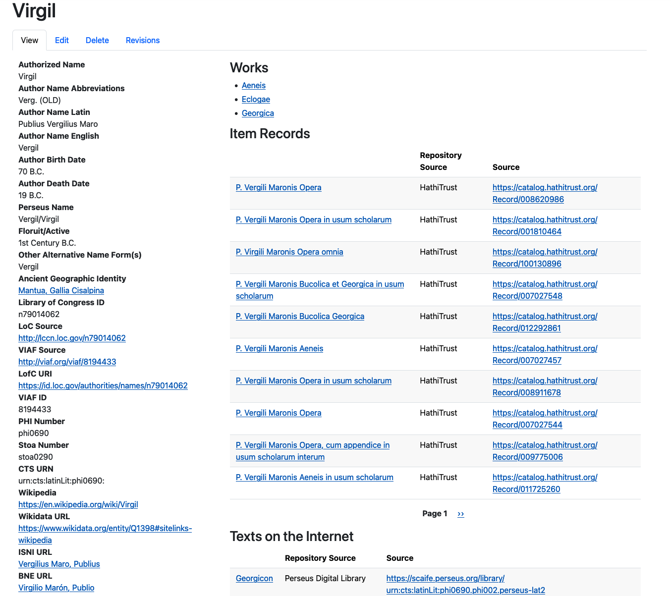
The content is being displayed, but it doesn't look very good because I haven't styled it.
Styling
I gave each of the different div elements an ID because that makes them easier to style on an individual basis, if I need to.
I'm going to give the author-data a background color of the light blue that is in the DLL's logo, and I'll insert a bit of padding at the top so that the content has some room to breathe:
#author-data {
  background-color: #eaf7fb;
  padding-top: 1rem;
}
I also want to insert some space between the fields for the sake of readability:
#author-data .field {
  margin-bottom: 1rem;
}
I like the way the field labels on the old site were in all capitals, so I'll do that:
#author-data .field__label {
  text-transform: uppercase;
}
Finally, I'd like to give the author-data section a header and use the icon for author authorities that the old theme included. To do that, I'll need to edit the node--author-authorities--full.html.twig template by inserting <h3>Author Data</h3> inside of <div id="author-data">. I will also need to make an image directory in my subtheme and add the image I need. After that, I can use CSS to add the image to the header:
#author-data h3 {
  background-image: url(/themes/custom/dll_catalog/images/authority-record-on-blue.svg);
  border-bottom: thin solid gray;
  background-repeat: no-repeat;
  background-position: left top;
  padding: 0 0 0.75rem 3rem;
}
Actually, since I want those last four properties to apply to h3 in the contextual-views column, too, I'll do this:
#author-data h3,
#author-contextual-views h3 {
  border-bottom: thin solid gray;
  background-repeat: no-repeat;
  background-position: left top;
  padding: 0 0 0.75rem 3rem;
}
And now my author-data heading can be styled like this:
#author-data h3 {
  background-image: url(/themes/custom/dll_catalog/images/authority-record-on-blue.svg);
}
I'll do something similar for the contextual views. First of all, I want to increase the space between the sections, so I'll use the margin-bottom property:
#author-contextual-views > div {
  margin-bottom: 3.5rem;
}
I already added #author-contextual-views h3 to the block for author-data h3 to make sure that the headings in this section have the same border. Now I will add the background images to the h3 tags for each contextual view:
#author-works h3 {
  background-image: url(/themes/custom/dll_catalog/images/dll-work-on-blue.svg);
}

#author-item-records h3 {
  background-image: url(/themes/custom/dll_catalog/images/item-record-on-blue.svg);
}

#author-web-pages h3 {
  background-image: url(/themes/custom/dll_catalog/images/webpage-on-blue.svg);
}
If I compile my SCSS (sass scss/style.scss css/style.css && sass scss/ck5style.scss css/ck5style.css) and refresh the caches (drush cr), I can see the outcome of this work:
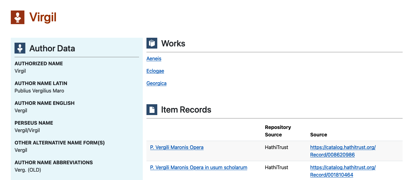
The images are in place and the headings look okay, but I'm not wild about the look. On the old site, the blue side bar was on the right side of the page. I could just switch the order of the div elements and put the one with id="author-contextual-views" first, but that would cause trouble on smaller screen sizes, since the author data would be pushed to the very bottom of the screen, requiring the user to scroll and scroll to see it.
What's the solution? This might be a good place for Bootstrap's order class, which allows you to control the order in which elements are displayed on different screen sizes.
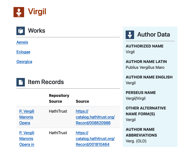
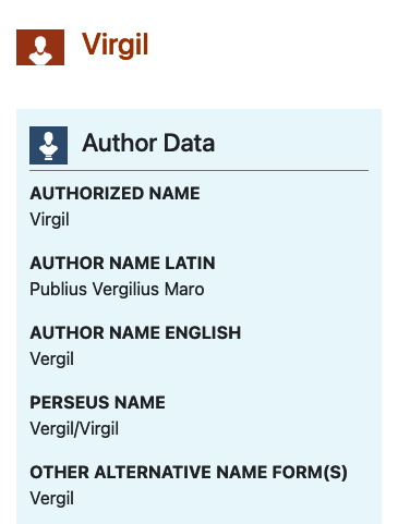
If I add order-lg-2 order-md-2 to the div with id="author-data" and order-lg-1 order-md-1 to the div with id="author-contextual-views, I can reverse the order in which the div elements will be displayed: order-lg-2 order-md-2 cause theauthor-data div to be displayed second (i.e., on the right side of the page) on large (lg) and medium (md) screens, but it will be displayed in its natural order on small and extra-small screens. Here's the new code:
<div class="container">
  <div class="row">
    <div id="author-data" class="col-4">
      {{ content }}
    </div>
    <div id="author-contextual-views" class="col-8">


        <div id="author-works">
            <h3>Works</h3>
            {{ drupal_view('contextual_view_for_author_authority', 'page_1', arg_1) }}
        </div>
        <div id="author-item-records">
        <h3>Item Records</h3>
            {{ drupal_view('contextual_view_for_author_authority', 'page_2', arg_1) }}
        </div>
        <div id="author-web-pages">
            <h3>Texts on the Internet</h3>
            {{ drupal_view('contextual_view_for_author_authority', 'page_3', arg_1) }}
        </div>
    </div>
  </div>
</div>
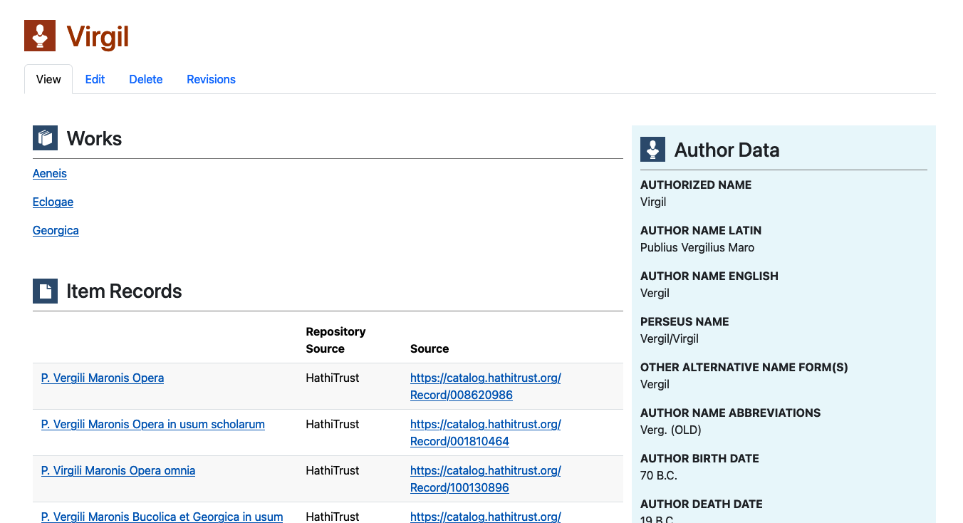
Here's a screenshot of the page viewed on a desktop screen:
Here it is on a tablet:
And here it is, with the columns in their natural order, on a phone:
Takeaways
It should be pretty clear that Bootstrap, Twig, and CSS are a powerful combination.
- Bootstrap's grid system makes responsive content layout a breeze, as long as you remember that it's based on the number "12"
- Twig gives you almost total control over where (and whether!) your content is placed on the screen. The Twig Tweak module adds a lot of extra functionality to Twig's already full feature set.
- CSS gives you a log of control over the appearance of the content. With just a little knowledge of CSS, you can do quite a lot!
In the next post, I'll use my node--author-authorities--full.html.twig file and the CSS work that I did to theme the other content types.