Rebuilding A Theme, Part VI: Customizing the Footer
Posted: July 15, 2024 in Drupal, Front End Development
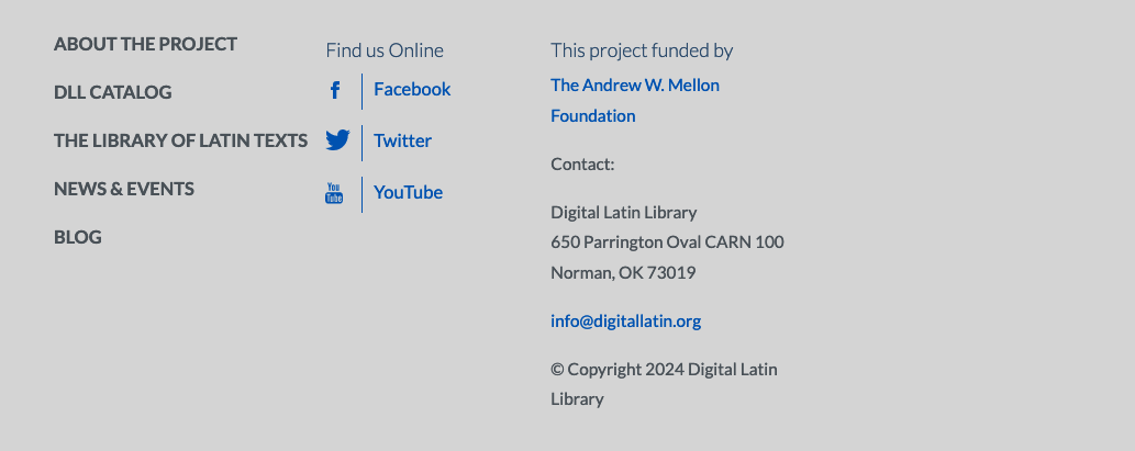
The footer on the old Drupal 7 version of the DLL Catalog site looks like this:

After migration to Drupal 10, this is what the footer looks like without any extra theming:

I kind of like the darker gray, so I'll keep it. But I need to restore the footer menu, the contact information, and the social media icons and links.
Inspecting the Structure of the Footer
Using the Developer Tools, I see that the footer is handled by a number of different templates, but region.html.twig is the one responsible for the overall structure. Since I want to have three columns in my footer (one each for navigation, social media, and contact information), I'm going to use Twig's file name suggestion and create a new template in my subtheme's templates/layouts directory called region--footer.html.twig. I'll copy the contents of Bootstrap5 parent theme's region.html.twig file as a starting place and customize it for my purposes.
Creating a Three-column Layout
My new region--footer.html.twig template looks like this:
{%
  set classes = [
    'region',
    'region-' ~ region|clean_class,
  ]
%}
{% if content %}
  <div{{ attributes.addClass(classes) }}>
    {{ content }}
  </div>
{% endif %}
To create the three-column layout, I'll focus on the part between the if content and endif tags.
In Bootstrap, columns are easy to make: we need a div with class container, another div inside that with class row, and then divs with class col inside of that. So, here's my customized template, with some placeholder text:
{%
  set classes = [
    'region',
    'region-' ~ region|clean_class,
  ]
%}

  <div{{ attributes.addClass(classes) }}>
    <div class="container">
      <div class="row align-items-start">
        <div class="col">
          <p>First column</p>
        </div>
        <div class="col">
          <p>Second column</p>
        </div>
        <div class="col">
          <p>Third column</p>
        </div>
      </div>
    </div>
  </div>
After clearing the caches, this is what it looks like:

That's a start. I want the first column to have a footer navigation menu, and I'd like to use that to point users to other parts of the DLL's corner of the internet. In my case, the footer menu from the old site came over in the migration, so I can simply place the menu into the first column with some help from the Twig Tweak module.
Place an Existing Menu
The first step in placing a menu into a template is finding the machine name for the block. The simplest way to do this is in the UI:
- Go to
admin/structure/menuin your site - Look for the menu you want and click "Edit menu"
- Copy whatever is in the "Machine name" field. In my case, it was
menu-footer-menu.
When you have the machine name of your block, add it to the Twig template like this:
{{ drupal_menu('menu-footer-menu') }}In my case, I did this:
{%
  set classes = [
    'region',
    'region-' ~ region|clean_class,
  ]
%}

  <div{{ attributes.addClass(classes) }}>
    <div class="container">
      <div class="row align-items-start">
        <div class="col">
          {{ drupal_menu('menu-footer-menu') }}
        </div>
        <div class="col">
          <p>Second column</p>
        </div>
        <div class="col">
          <p>Third column</p>
        </div>
      </div>
    </div>
  </div>
That does the trick for my footer navigation menu:

Social Icons
I like to use Nifty Buttons for social media icons. It makes the job easy and quick with a very simple workflow. I need icons for Facebook, Twitter (a.k.a. "X"), and YouTube, so I'll go to Nifty Buttons and select my icons, choose the background shape, customize the colors, and add the links to the social media feeds. I choose to donate to the developer, so after I take care of that, I get my code:
<!-- Social Media Icons by NiftyButtons https://niftybuttons.com -->
<div style="display: grid">
  <a
    href="https://www.facebook.com/digitallatin"
    target="_blank"
    rel="noopener noreferrer"
    style="text-decoration:none;border:0;width:36px;height:36px;padding:0;margin:3px;color:#fff;"
  >
    <svg
      class="niftybutton-facebook"
      style="display:block;fill:currentColor"
      data-donate="true"
      data-tag="fac"
      data-name="Facebook"
      viewbox="0 0 512 512"
      preserveaspectratio="xMidYMid meet"
    >
      <title>Facebook social icon</title>
      <path
        d="M211.9 197.4h-36.7v59.9h36.7V433.1h70.5V256.5h49.2l5.2-59.1h-54.4c0 0 0-22.1 0-33.7 0-13.9 2.8-19.5 16.3-19.5 10.9 0 38.2 0 38.2 0V82.9c0 0-40.2 0-48.8 0 -52.5 0-76.1 23.1-76.1 67.3C211.9 188.8 211.9 197.4 211.9 197.4z"
      ></path>
    </svg>
  </a>
  <a
    href="https://x.com/digitallatin"
    target="_blank"
    rel="noopener noreferrer"
    style="text-decoration:none;border:0;width:36px;height:36px;padding:0;margin:3px;color:#fff;"
  >
    <svg
      class="niftybutton-twitter"
      style="display:block;fill:currentColor"
      data-donate="true"
      data-tag="twi"
      data-name="Twitter"
      viewbox="0 0 512 512"
      preserveaspectratio="xMidYMid meet"
    >
      <title>Twitter social icon</title>
      <path
        d="M419.6 168.6c-11.7 5.2-24.2 8.7-37.4 10.2 13.4-8.1 23.8-20.8 28.6-36 -12.6 7.5-26.5 12.9-41.3 15.8 -11.9-12.6-28.8-20.6-47.5-20.6 -42 0-72.9 39.2-63.4 79.9 -54.1-2.7-102.1-28.6-134.2-68 -17 29.2-8.8 67.5 20.1 86.9 -10.7-0.3-20.7-3.3-29.5-8.1 -0.7 30.2 20.9 58.4 52.2 64.6 -9.2 2.5-19.2 3.1-29.4 1.1 8.3 25.9 32.3 44.7 60.8 45.2 -27.4 21.4-61.8 31-96.4 27 28.8 18.5 63 29.2 99.8 29.2 120.8 0 189.1-102.1 185-193.6C399.9 193.1 410.9 181.7 419.6 168.6z"
      ></path>
    </svg>
  </a>
  <a
    href="https://www.youtube.com/@DigitalLatinLibrary"
    target="_blank"
    rel="noopener noreferrer"
    style="text-decoration:none;border:0;width:36px;height:36px;padding:0;margin:3px;color:#fff;"
  >
    <svg
      class="niftybutton-youtube"
      style="display:block;fill:currentColor"
      data-donate="true"
      data-tag="you"
      data-name="YouTube"
      viewbox="0 0 512 512"
      preserveaspectratio="xMidYMid meet"
    >
      <title>YouTube social icon</title>
      <path
        d="M422.6 193.6c-5.3-45.3-23.3-51.6-59-54 -50.8-3.5-164.3-3.5-215.1 0 -35.7 2.4-53.7 8.7-59 54 -4 33.6-4 91.1 0 124.8 5.3 45.3 23.3 51.6 59 54 50.9 3.5 164.3 3.5 215.1 0 35.7-2.4 53.7-8.7 59-54C426.6 284.8 426.6 227.3 422.6 193.6zM222.2 303.4v-94.6l90.7 47.3L222.2 303.4z"
      ></path>
    </svg>
  </a>
  <a
    href="https://catalog.digitallatin.org/rss"
    target="_blank"
    rel="noopener noreferrer"
    style="text-decoration:none;border:0;width:36px;height:36px;padding:0;margin:3px;color:#fff;"
  >
    <svg
      class="niftybutton-rss"
      style="display:block;fill:currentColor"
      data-donate="true"
      data-tag="rss"
      data-name="RSS"
      viewbox="0 0 512 512"
      preserveaspectratio="xMidYMid meet"
    >
      <title>RSS icon</title>
      <path
        d="M201.8 347.2c0 20.3-16.5 36.8-36.8 36.8 -20.3 0-36.8-16.5-36.8-36.8s16.5-36.8 36.8-36.8C185.3 310.4 201.8 326.8 201.8 347.2zM128.2 204.7v54.5c68.5 0.7 124 56.3 124.7 124.7h54.5C306.7 285.3 226.9 205.4 128.2 204.7zM128.2 166.6c57.9 0.3 112.3 22.9 153.2 63.9 41 41 63.7 95.5 63.9 153.5h54.5c-0.3-149.9-121.7-271.4-271.6-271.9V166.6L128.2 166.6z"
      ></path>
    </svg>
  </a>
</div>
That's cool, but I made some alterations. For one, that's a lot of CSS in the style attribute, and it's repeated four times. I like to keep my code "DRY" ("Don't Repeat Yourself"), as much as possible, so I've copied the content of style on a into a class in my subtheme's style.scss file and replaced the entire style attribute string with class="social-icon". In my style.scss file, I added this:
.social-icon {
  text-decoration: none;
  border: 0;
  width: 36px;
  height: 36px;
  padding: 0;
  margin: 3px;
  color: #fff;
}
I also didn't want my icons to be on one line, but rather stacked vertically. To accomplish that, I replaced the style of the parent div with display: grid. That's all it took! Here's the footer with the social icons:

Contact Information
For the contact information, I'm going to use a Drupal block. I could hard code it into the template, but hard-coding text is to be avoided, if possible, because it makes it difficult for future developers to track down. It's best to leave content in the Content Management System and reserve cosmetics for the theme.
As it happens, my footer contact block was included in the migration, so I don't have to do much. To create a custom block, go to admin/content/block in the UI and select "+Add content block". Add a description of the block in the "Block description" field and then insert the content into the "Body" field and click "Save".
I need to find the ID of my footer contact block. The simplest way to do that is in the UI:
- Go to
admin/content/block - Click the link for the block that you want
- Look at the URL in the browser: the ID is the last part of the address.
My footer contact block has ID "2", so now I can insert the following into my Twig template:
{{ drupal_entity('block_content', 2) }}Here's the code for the final column of my footer:
<div class="col">
  {{ drupal_entity('block_content', 2) }}
</div>
Here's how it looks:

Almost done!
Copyright
On the old site, the copyright statement was just a simple text string: "© Copyright 2024 Digital Latin Library". That's okay, but it means that I have to be sure to update the year each January 1. Since I often forget to do that, I'm going to automate it with a Twig filter.
Twig has a ton of built-in functionality, including a date filter that, obviously, renders the date based on the information provided by the server. You can learn all about Twig filters at https://twig.symfony.com/doc/3.x/.
In this simple case, I'm going to add this to the div that contains my site's contact information:
<div id="copyright">
  © {{ 'now' | date('Y') }} Digital Latin Library
</div>
That translates to "get the current date and show only the year."
After clearing the cache, this is how my footer looks:

Adding a Hint of Pizzazz
It's nice to show users which links are active, so I'm going to add some CSS to make the links change color when a user hovers the mouse over them:
footer.footer-dark a:hover,
.social-icon a:hover {
  color: #a33701;
}
Now the links turn a reddish-brown color on hover.
Making the Footer More Responsive
The footer looks okay on large and medium devices, but it's going to run into trouble on small screens because the columns are going to be scrunched into each other. I'd prefer them to be stacked on top of each other instead, so I'll edit their class to col-md. The md stands for medium, and it refers to the breakpoint at which stacking will cease to occur. My final code for the footer looks like this:
{%
  set classes = [
    'region',
    'region-' ~ region|clean_class,
  ]
%}

<div{{ attributes.addClass(classes) }}>
  <div class="container">
    <div class="row align-items-start">
      <div id="footer-menu" class="col-md">
      {# Insert the footer menu. #}
        {{ drupal_menu('menu-footer-menu') }}
      </div>
      <div id="social-media-icons" class="col-md">
        <!-- Social Media Icons by NiftyButtons https://niftybuttons.com -->
        <div style="display: grid">
          <a href="https://www.facebook.com/digitallatin" target="_blank" rel="noopener noreferrer" class="social-icon">
            <svg class="niftybutton-facebook" style="display:block;fill:currentColor" data-donate="true" data-tag="fac" data-name="Facebook" viewbox="0 0 512 512" preserveaspectratio="xMidYMid meet">
              <title>Facebook social icon</title>
              <path d="M211.9 197.4h-36.7v59.9h36.7V433.1h70.5V256.5h49.2l5.2-59.1h-54.4c0 0 0-22.1 0-33.7 0-13.9 2.8-19.5 16.3-19.5 10.9 0 38.2 0 38.2 0V82.9c0 0-40.2 0-48.8 0 -52.5 0-76.1 23.1-76.1 67.3C211.9 188.8 211.9 197.4 211.9 197.4z"></path>
            </svg>
          </a>
          <a href="https://x.com/digitallatin" target="_blank" rel="noopener noreferrer" class="social-icon">
            <svg class="niftybutton-twitter" style="display:block;fill:currentColor" data-donate="true" data-tag="twi" data-name="Twitter" viewbox="0 0 512 512" preserveaspectratio="xMidYMid meet">
              <title>Twitter social icon</title>
              <path d="M419.6 168.6c-11.7 5.2-24.2 8.7-37.4 10.2 13.4-8.1 23.8-20.8 28.6-36 -12.6 7.5-26.5 12.9-41.3 15.8 -11.9-12.6-28.8-20.6-47.5-20.6 -42 0-72.9 39.2-63.4 79.9 -54.1-2.7-102.1-28.6-134.2-68 -17 29.2-8.8 67.5 20.1 86.9 -10.7-0.3-20.7-3.3-29.5-8.1 -0.7 30.2 20.9 58.4 52.2 64.6 -9.2 2.5-19.2 3.1-29.4 1.1 8.3 25.9 32.3 44.7 60.8 45.2 -27.4 21.4-61.8 31-96.4 27 28.8 18.5 63 29.2 99.8 29.2 120.8 0 189.1-102.1 185-193.6C399.9 193.1 410.9 181.7 419.6 168.6z"></path>
            </svg>
          </a>
          <a href="https://www.youtube.com/@DigitalLatinLibrary" target="_blank" rel="noopener noreferrer" class="social-icon">
            <svg class="niftybutton-youtube" style="display:block;fill:currentColor" data-donate="true" data-tag="you" data-name="YouTube" viewbox="0 0 512 512" preserveaspectratio="xMidYMid meet">
              <title>YouTube social icon</title>
              <path d="M422.6 193.6c-5.3-45.3-23.3-51.6-59-54 -50.8-3.5-164.3-3.5-215.1 0 -35.7 2.4-53.7 8.7-59 54 -4 33.6-4 91.1 0 124.8 5.3 45.3 23.3 51.6 59 54 50.9 3.5 164.3 3.5 215.1 0 35.7-2.4 53.7-8.7 59-54C426.6 284.8 426.6 227.3 422.6 193.6zM222.2 303.4v-94.6l90.7 47.3L222.2 303.4z"></path>
            </svg>
          </a>
          <a href="https://catalog.digitallatin.org/rss" target="_blank" rel="noopener noreferrer" class="social-icon">
            <svg class="niftybutton-rss" style="display:block;fill:currentColor" data-donate="true" data-tag="rss" data-name="RSS" viewbox="0 0 512 512" preserveaspectratio="xMidYMid meet">
              <title>RSS icon</title>
              <path d="M201.8 347.2c0 20.3-16.5 36.8-36.8 36.8 -20.3 0-36.8-16.5-36.8-36.8s16.5-36.8 36.8-36.8C185.3 310.4 201.8 326.8 201.8 347.2zM128.2 204.7v54.5c68.5 0.7 124 56.3 124.7 124.7h54.5C306.7 285.3 226.9 205.4 128.2 204.7zM128.2 166.6c57.9 0.3 112.3 22.9 153.2 63.9 41 41 63.7 95.5 63.9 153.5h54.5c-0.3-149.9-121.7-271.4-271.6-271.9V166.6L128.2 166.6z"></path>
            </svg>
          </a>
        </div>
      </div>
      <div id="contact" class="col-md">
        {{ drupal_entity('block_content', 2) }}
        <div id="copyright">
          © {{ 'now' | date('Y') }} Digital Latin Library
        </div>
      </div>
    </div>
  </div>
</div>
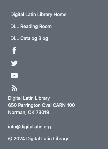
On small screens, the footer now looks like this:

Takeaways
- Making a columnar layout is easy with Bootstrap
- The Twig Tweak module makes it easy to place Drupal menus and blocks wherever you need to place them, if you know how to find the information you need
- Nifty Buttons is an excellent source for social media icons
- Twig functions can interact with the server to get the current date
- Bootstrap's
colstyle can be enhanced with breakpoints (e.g.,col-md) to tell browsers to display the content differently according to screen size
In the next post, I'll work on the contextual views I'll need before I work on styling the content types.