
Rebuilding A Theme, Part IX: Content Types, Continued
Posted: July 18, 2024 in Drupal, Front End Development
As I mentioned in the last post, The DLL Catalog site has four main content types:
- Author Authority: Nodes in this content type contain information about an author's authorized name, variations on the name, dates, and various identifiers.
- DLL Work: This content type contains the title(s) of works.
- Item Record: These nodes contain metadata for published editions of works.
- Web Page: This content type is for internet pages that present the texts of works.
The site also makes use of the default Drupal content types Article (for blog posts and updates) and Basic Page (for static content).
The work I did on the Author Authority content type will be the starting place for working on the other content types. I'll start with DLL Work.
DLL Work
Nodes of the DLL Work content type on the old version of the site look like this:
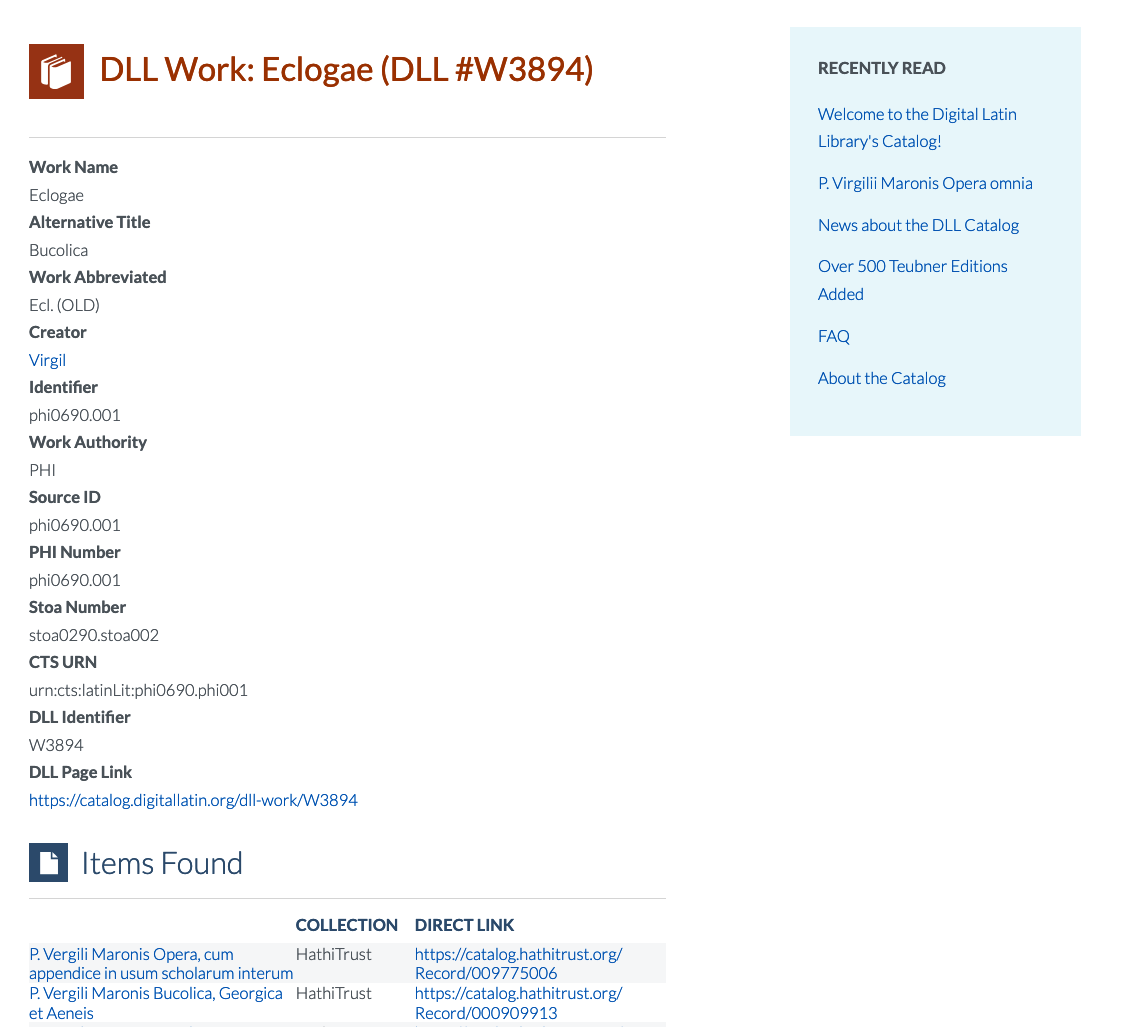
Like the old Author Authority page, the old DLL Work page is based on Panels, but I don't want to use that module anymore. Fortunately, the layout of the two pages is very similar: two-columns of different widths and colors. My first step, then, is to make a copy of the node--author-authorities.html.twig template and name it node--dll-work.html.twig, according to the file name suggestions provided by Twig. Mutatis mutandis, here is the content of the new template:
{%
  set classes = [
    'node',
    'node--type-' ~ node.bundle|clean_class,
    node.isPromoted() ? 'node--promoted',
    node.isSticky() ? 'node--sticky',
    not node.isPublished() ? 'node--unpublished',
    view_mode ? 'node--view-mode-' ~ view_mode|clean_class,
  ]
%}
{{ attach_library('bootstrap5/node') }}
<article{{attributes.addClass(classes)}}>

 {{ title_prefix }}
 {% if label and not page %}
  <h2{{title_attributes}}>
   <a href="{{ url }}" rel="bookmark">{{ label }}</a>
  </h2>
 {% endif %}
 {{ title_suffix }}

 <div{{content_attributes.addClass('node__content')}}>
        <div class="container">
            <div class="row">
                {# Render the content of the DLL Work node in a thin column #}
                <div id="work-data" class="col-md-4 col-md-4 order-lg-2 order-md-2">
                    <h3>DLL Work Data</h3>
                    {{ content }}
                </div>
                {# Render the contextual views in a wider column #}
                <div id="work-contextual-views" class="col-md-8 order-lg-1 order-md-1">
                    {# Set the variable for the contextual filter #}
                    {% set arg_1 = node.field_dll_identifier.value %}
                    <div id="work-item-records">
                        <h3>Item Records</h3>
                        {{ drupal_view('contextual_view_for_dll_work', 'page_1', arg_1) }}
                    </div>
                    <div id="work-web-pages">
                        <h3>Texts on the Internet</h3>
                        {{ drupal_view('contextual_view_for_dll_work', 'page_2', arg_1) }}
                    </div>
                </div>
            </div>
        </div>
 </div>

</article>
The only things I changed are the values of the ID attributes on the div elements (e.g., from author-data to work-data) and the information for the contextual views. Everything else is the same.
Now I need to update my style.scss file. Since I'm going for the same basic look, I can piggy-back onto the styles I wrote for the Author Authority page. For example, to match the blue background and other formatting of the author-data column, I can just add #work-data to those blocks in style.css:
#author-data,
#work-data {
  background-color: #eaf7fb;
  padding-top: 1rem;
  margin-bottom: 1rem;
}

#author-data .field,
#work-data .field {
  margin-bottom: 1rem;
}

#author-data .field__label,
#work-data .field__label {
  text-transform: uppercase;
}
Note that I inserted a comma after the existing style, then added #word-data. I'll do the same thing to the other styles:
#author-contextual-views > div,
#work-contextual-views > div {
  margin-bottom: 3.5rem;
}

#author-data h3,
#author-contextual-views h3,
#work-data h3,
#work-contextual-views h3 {
  border-bottom: thin solid gray;
  background-repeat: no-repeat;
  background-position: left top;
  padding: 0 0 0.75rem 3rem;
}

#author-data h3 {
  background-image: url(/themes/custom/dll_catalog/images/authority-record-on-blue.svg);
}

#work-data h3 {
  background-image: url(/themes/custom/dll_catalog/images/dll-work-on-blue.svg);
}

#author-works .views-field-title {
  margin-bottom: 1rem;
}

#author-works h3 {
  background-image: url(/themes/custom/dll_catalog/images/dll-work-on-blue.svg);
}

#author-item-records h3,
#work-item-records h3 {
  background-image: url(/themes/custom/dll_catalog/images/item-record-on-blue.svg);
}

#author-web-pages h3,
#work-web-pages h3 {
  background-image: url(/themes/custom/dll_catalog/images/webpage-on-blue.svg);
}
After compiling the SCSS (sass scss/style.scss css/style.css && sass scss/ck5style.scss css/ck5style.css) and clear the caches (drush cr), this is what I see on my screen:
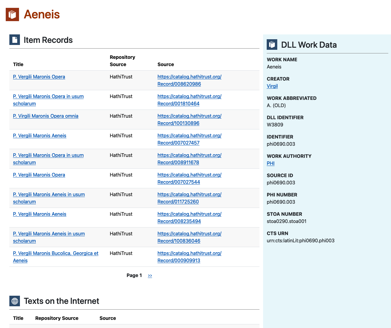
That was pretty easy!
Item Record
Comparatively speaking, the Item Record content type has a pretty straightforward display. Here's a screenshot of the old version:
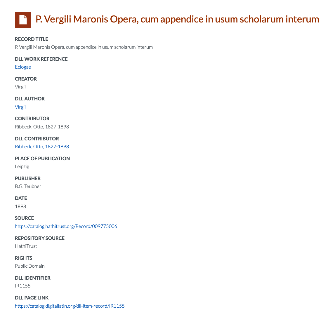 .
.
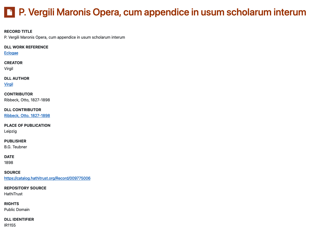
Here's the same record on the new site, without any extra styling:
.
I don't need to do much to it! Hooray!
I'll just transform the field labels to uppercase, adjust the spacing, and add the icon to the heading. The first two items are easy: I'll just add the id for the content type to the relevant styles in style.scss
#author-data .field,
#work-data .field,
#item-record .field {
  margin-bottom: 1rem;
}

#author-data .field__label,
#work-data .field__label,
#item-record .field__label {
  text-transform: uppercase;
}
Now I'll add the icon to the heading. When I started to work on this, I noticed an opportunity to make my CSS less redundant. Here's the CSS for the headings of Author Authority and DLL Work nodes:
#author-authority-title {
  background-image: url(/themes/custom/dll_catalog/images/authority-record-on-orange.svg);
  margin-bottom: 2rem;
  background-size: 2.75rem 2.75rem;
  background-repeat: no-repeat;
  background-position: left 8px;
  padding: 0.25rem 0 1rem 3.75rem;
}

#dll-work-title {
  background-image: url(/themes/custom/dll_catalog/images/dll-work-on-orange.svg);
  margin-bottom: 2rem;
  background-size: 2.75rem 2.75rem;
  background-repeat: no-repeat;
  background-position: left 8px;
  padding: 0.25rem 0 1rem 3.75rem;
}
The only difference between them is the value of background-image. Instead of making a third block for item-record-title, I'll make one block for the positioning of all three, then separate blocks for the background images:
#author-authority-title,
#dll-work-title,
#item-record-title {
  margin-bottom: 2rem;
  background-size: 2.75rem 2.75rem;
  background-repeat: no-repeat;
  background-position: left 8px;
  padding: 0.25rem 0 1rem 3.75rem;
}

#author-authority-title {
  background-image: url(/themes/custom/dll_catalog/images/authority-record-on-orange.svg);
}

#dll-work-title {
  background-image: url(/themes/custom/dll_catalog/images/dll-work-on-orange.svg);
}

#item-record-title {
  background-image: url(/themes/custom/dll_catalog/images/item-record-on-orange.svg);
}
Now, if I need to adjust the positioning of all three title areas, I can do it in one place.
After compiling the SCSS (sass scss/style.scss css/style.css && sass scss/ck5style.scss css/ck5style.css) and clear the caches (drush cr), this is what I see on my screen:
Web Page
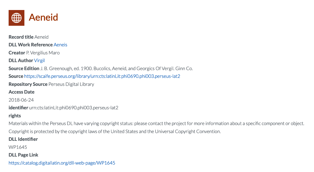
I can repeat the process for the Web Page content type. Here's how a Web Page node appears on the old site:
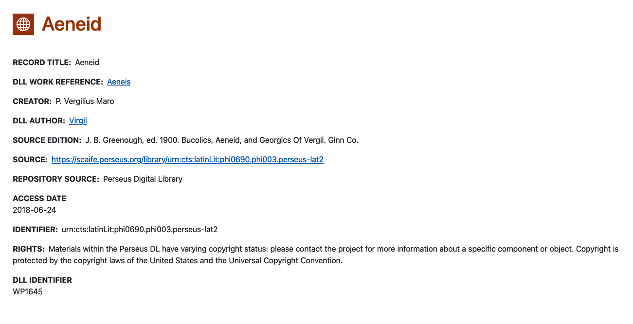
And here is the same content on the new page, after I add the relevant ID values to the existing styles:
Takeaway
Repurposing existing templates and styles is a great way to save time and make your code more efficient! After investing time in styling the Author Authority content type, I was able to do the other three main content types in one morning!