Rebuilding A Theme, Part V: Customizing the Navbar
Posted: July 12, 2024 in Drupal, Front End Development
Bootstrap's Navbar
I could spend a long time reinventing the wheel or implementing a snazzy navigation bar, but I don't have that kind of time, and I'm not a professional graphic designer. I want something simple that just works. Fortunately, Bootstrap's navbar has me covered. The trade-off is that my site's navbar will look like other sites made with Bootstrap, but that's okay with me. The ease of implementing a responsive navbar more than makes up for it.
Still, there are things I can do to make my site distinctive. That's the subject of this post.
My Navbar Without Styling
As a reminder, after I changed the background color of the navbar in the last post, my site's header looked like this:

Logo
The name of the site and its logo are handled by the "branding block". My subtheme of Bootstrap5 came with a logo.svg (= Scalable Vector Graphic, a particularly good format for images that must be used in different places with different sizes), a favicon.ico file, and a screenshot.png file to display in the "Appearance" menu of Drupal's user interface. My first task is to replace them with the DLL's files.
I happened to have those files from a previous version of the site, so I dropped them into the subtheme's root directory. Since the "Appearance" menu of my site is already set to use the theme's logo and shortcut icon, I just cleared the caches (drush cr), and voilà:

Site Name
As the last screenshot shows, I now have a logo that says "Digital Latin Library" and some text that says "DLL CATALOG" in big, chunky letters. I want the text to match or at least resemble the text on the old site:

I can do this with some CSS code. Using my browser's Developer Tools, I inspect the site's name and find that it has the class "site-title":
<a href="/" title="Home" rel="home" class="site-title">DLL Catalog</a>The CSS window shows that the following code applies to that class:
font-size: 1.5rem;
font-weight: bold;
letter-spacing: 2px;
text-transform: uppercase;
If I remove the font-weight and text-transform properties, my site's name looks like this:

That's better, but not quite what I want yet. If I bump the font-size up to 2rem and set the font-weight to lighter, it looks good enough for my purposes.

We're almost there, but there's a problem: on smaller screens (e.g., tablets and phones), the 2rem font size will be out of proportion to the logo, which will scale down as the screen size decreases. Instead of specifying separate sizes for tablets and phones, I can use the value larger, which is proportional. I'll also use a media query to make the value change according to screen size:
/* Change the appearance of the site's name */

.navbar-brand .site-title {
  font-size: larger;
  font-weight: lighter;
  letter-spacing: 2px;
  text-transform: none;
}

/* Media query for large screens */
@media (min-width: 992px) {
  .navbar-brand .site-title {
    font-size: 2rem;
  }
}
Now, as we'll see below, the font size of the site's name changes in proportion to the screen size. That's an improvement from the standpoint of accessibility, since the site's name in the old version was part of an image file. Now it is in plain text for anyone to read, however they might read it.
Menus
Just looking at the screenshot above, it's clear that the navigation menu is out of control. The old site had menus with sub menus leading to pages on the other sites in the DLL's domain. There was a point to that: to make sure that users understood where they were in the DLL's corner of the internet. After all, we have the main informational site (https://digitallatin.org/), the online reading interface for Library of Digital Latin Texts (https://ldlt.digitallatin.org/), and the DLL Catalog (https://catalog.digitallatin.org/), so it is important to provide some signposting for users. But the way we were doing it on the old version of the catalog site made the navigation far too busy and cluttered. Besides, it's best to keep a site's main navigation menu simple so that it will be easy to use on mobile, tablet, laptop, and desktop devices. Moreover, dropdown submenus have to be styled, and that is a tedious job.
Fortunately, clearing up the main navigation menu is simple. When I migrated the site to Drupal 10, all the menus were included. That means that I can go into the "Menus" interface (/admin/structure/menu) and turn off or delete any items I don't want to appear in the new version.
For now, I'll disable all the main menu items:

The navbar still has the user menu ("My Account" and "Log Out" for logged-in users) and a search bar. I don't need the user menu, since users don't need accounts to use the site, and I can log in using /user/login whenever I need to. I also plan to make the search bar a much more prominent part of the site, so I can get rid of that, too. In this case, instead of disabling those menu items, I'll edit the Twig template page.html.twig, which has this code near the top:
<button
  class="navbar-toggler collapsed"
  type="button"
  data-bs-toggle="collapse"
  data-bs-target="#navbarSupportedContent"
  aria-controls="navbarSupportedContent"
  aria-expanded="false"
  aria-label="Toggle navigation"
>
  <span class="navbar-toggler-icon"></span>
</button>

<div class="collapse navbar-collapse justify-content-md-end" id="navbarSupportedContent">
   {{ page.nav_main }} {{ page.nav_additional }}
</div>
The user menu and search bar are included in {{ page.nav_additional }}, so if I remove that line, I'll have this:

Now I can think more clearly about what I want in that space. The old site had a secondary menu with links relevant to the DLL Catalog:

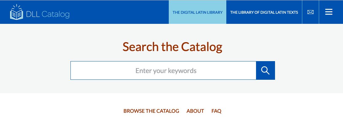
It would make a lot more sense to put that into the main navigation space. So, I'll go into the "Menus" interface (/admin/structure/menu) edit the "Main menu" (/admin/structure/menu/manage/main), et voilà:

What's more, without having to do anything extra (other than the media query I mentioned above), my navbar responds well to different screen sizes. I can do a quick check with my browser's "Developer Tools" if I click on the icon that looks like a phone next to a tablet. That opens up a new menu that lets me emulate the appearance of my site on numerous devices of different shapes and sizes.
Here is my navbar on a tablet:

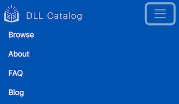
And here it is on a phone:

In both cases, the menu turns into a "hamburger menu" that will expand when clicked:

I didn't have to write any code to make that happens, since it is baked into Bootstrap's grid system!
Now that I've styled the navbar, I'll work on the footer in the next post.