
Rebuilding A Theme, Part XII: Styling the Search Page
Posted: July 24, 2024 in Drupal, Front End Development
Now that I have a search view and a template for displaying it (see part 11 of this series), I can begin styling it.
Here is what that looks like without any styling:
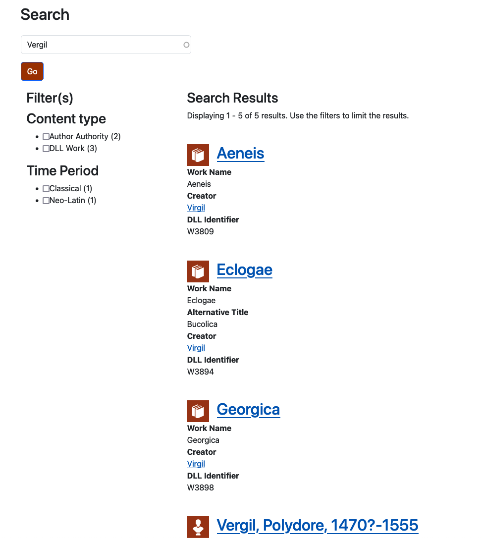
My goals are:
- To display the search form prominently in the center of the page
- To give the facets a background color and to remove the redundant bullets from the checkboxes
- To make the display of results tidier and easier to read
I'll be working mostly in the style.scss file to accomplish those goals.
Search Form
First I'll center the search form's heading. Using my browser's web developer tools, I see that it has the following classes: views-exposed-form contextual-region block block-views block-views-exposed-filter-blockmain-solr-search-search. The last one is the most specific, so I'll use that:
.block-views-exposed-filter-blockmain-solr-search-search h2 {
  text-align: center;
  margin-bottom: 2rem;
}
Now I want to center the form. Using the web developer tools, I'll highlight the form and inspect its HTML and CSS. I see that the div enclosing it is currently subject to this:
.form--inline .form-item {
  float: left;
  margin-right: 0.5em;
}
Both the float and margin-right properties will interfere with any effort to center the form, so I'll need to override them. But I don't want to override them globally; I just want to override them in this one place. I'll do that by adding another one of the classes that I see on the div: form-type-search-api-autocomplete. Here's the CSS:
/* Centering the search box.*/
.form--inline .form-item.form-type-search-api-autocomplete {
  float: none;
  width: 75%;
  text-align: center;
  margin-left: auto;
  margin-right: auto;
}
That takes care of the float, and it uses the value of auto on margin-left and margin-right to center the div.

The helper text inside the input area is aligned to the left. It would look better aligned to the center. Since I don't want to style all input tags, I'll specify the input tag inside of the form with id="views-exposed-form-main-solr-search-search":
/* Centering the search terms */
#views-exposed-form-main-solr-search-search input {
  text-align: center;
}
Now I'll deal with the "Go" button. After some experimentation, I found that I could control the placement of the button by setting text-align on form with id="views-exposed-form-main-solr-search-search" to center. Since that is the same style for the search terms above, I can just add that selector to the existing style:
/* Centering the search terms and the "Go" button */
#views-exposed-form-main-solr-search-search,
#views-exposed-form-main-solr-search-search input {
  text-align: center;
}
Cool! Now I can move on to styling the facets and the search results.
Facets
The first thing I want to do is set a background color for the facets. I like the light blue color that I used for the sidebar in the templates for my content types, so I'll use that. When I created the page--search.html.twig template, I added the class search-sidebar to the div where the facets are placed. That means that I can set background-color on that div. I'll also give it some padding, so that the content isn't smooshed on all sides.
/* Search Sidebar (facets) */
.search-sidebar {
  background: #ade0f2;
  padding: 2rem 0.5rem 1.5rem 1rem;
}
The way I've handled padding is shorthand, by the way, for setting padding-top, padding-right, padding-bottom, and padding-left, in that order (i.e., clockwise).
I want the heading for the sidebar to be set off from the content, so I'll add a bottom border and some spacing:
/* Search sidebar h3 style */
.search-sidebar h3 {
  border-bottom: solid thin grey;
  padding-bottom: 0.5rem;
  margin-right: 2rem;
  margin-bottom: 1.25rem;
}
Now I need to remove the redundant bullets from the checkboxes and adjust for their removal. I can do that by specifying that li (list item) tags in the div with class search-sidebar should have their display property set to block.
/* Remove bullets from facet checkboxes */
.search-sidebar li {
  padding: 0;
  display: block;
  margin-left: 0;
}
While I'm at it, I'll add some spacing to the label, too:
/* Add some space between facet checkboxes and labels */
.search-sidebar label {
  margin-left: 0.5rem;
}
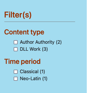
Now my facets sidebar is looking better!
On to the search results!
Search Results
I don't think the results require a lot of styling. To my admittedly untrained eye, the items in the list could benefit from a border to make them more distinct. I'll try adding a box shadow around them, too.
/* Search results */
#views-bootstrap-main-solr-search-search--2 article {
  border: thin solid grey;
  padding: 1rem;
  box-shadow: 0 0 5px rgba(0, 0, 0, 0.5);
}
The box-shadow might be over the top. I added it just as an example of what can be done with CSS. Here's a screenshot:
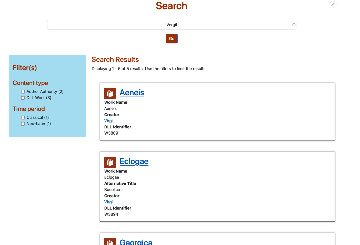
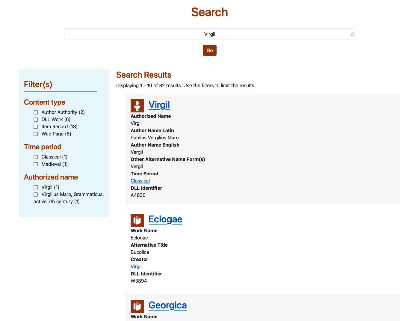
No, I don't like the box-shadow. Let's try giving a different background color to the odd items in the list. For this, I can use the nth-of-type(odd) pseudo-class. Since every result is a list item (li) in an unordered list (ul), and since each list item has the class list-group-item, I can apply a background color to the odd or even list items. For the record, I could also use a number (n) to specify every nth item. Here's what I ended up doing to give each odd item a grey background:
// Grey background for odd items in the search results
#views-bootstrap-main-solr-search-search--2 li.list-group-item:nth-of-type(odd) {
  background-color: #f6f7f8;
}
I also added another facet and selected a lighter shade of blue for the sidebar. Here's a screenshot:
Takeaways
I'm by no means a CSS guru, but I hope that I've demonstrated how powerful it is. With just a few properties and units in your toolbox, you can do quite a lot to change the look of your site.